
What I’ve learned about Flexbox and CSS Grid as a Designer
I’ve been learning web development for a few months now. The more I learn, the more I’m fascinated with what the layout system in CSS can do. While Figma’s Auto Layout is great, it doesn’t quite replicate the experience of using Flexbox and CSS Grid the way I’d like.
But here’s the thing, an understanding of these concepts can potentially help designers to have a better design structure and improved communication with engineers.
Here’s what I learned about Flexbox and CSS Grid
What is Flexbox and Grid?
They are the layout mechanisms to layout elements in websites including text, images, and other web elements.
What are the differences between Flexbox and CSS Grid?
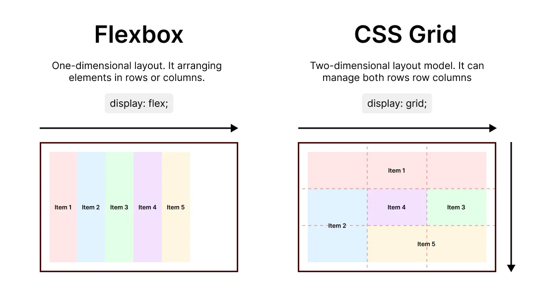
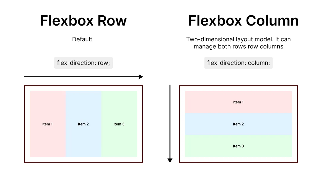
Flexbox: One-dimensional layout. It arranges elements in rows (horizontal) or columns (vertical).
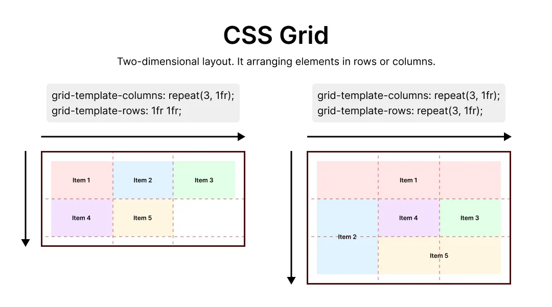
CSS Grid: Two-dimensional layout. Grid lets you create complex layouts with rows, columns, and even named areas for ultimate control. You can control how many columns and rows in a grid container.
This is just the tip of the iceberg, and I still have a lot more to learn. If you’re a designer who’s interesting in diving into web development, Flexbox and Grid are definitely worth exploring.